Smaller Charities, Bigger Visualizations
When you walk over the Dam square in Amsterdam, volunteers for various charity organization are scanning the crowd for potential contributors. Using appealing stories to convince the person into making a donation. It’s hard to keep track of the charities accomplishments. The newsletters you receive as a contributor leave everything to the imagination. Why should these organizations start using data visualization?
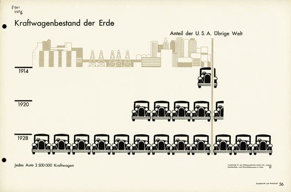
Otto Neurath created the International System of Typographic Picture Education (ISOTYPE) to create awareness in our society. Basic pictograph’s in an illustration could show massive sets of data. Neurath created museum exposition and developed documentaries with visualizations of important topics in society. Hans Rosling uses similar techniques to visualize big sets of data. Famous for his great presentations, Rosling lets global trends in health and economics come to life with his Gapminder tool. Engelhardt draws similarities between Neurath and Rosling in his paper Graphics with a cause. Engelhardt states that Neurath and Rosling share a set of beliefs. Information access for everyone, raising awareness, the power of visual representation and making use of the latest media technology. These beliefs are shared with media activism.
Lovink argues, in his book Zero Comments, that the rise of do-it-yourself empowered media activism has created new possibilities in the field. Tactical media criticizes social, political and cultural elements of a given society through its domain’s techniques. Micro projects on local issues are becoming a major trend in media activism. ‘It is not hard to see that the challenge for tactical media is no longer technical but resides in knowing how to negotiate difference within a loose and temporal network structure’(Lovink 2008) It’s easy to create a video and broadcast this on a video sharing platform on the Internet. Video’s about water pollution are a dime a dozen on Vimeo. When looking closely to these video’s, data visualization is a heavily used tool. An example is Water changes everything by Charity Water. It shows the effects of water on society. In the video water drops on a piece of paper and creates a map of Africa. These visualizations create cognitive links with our already existing knowledge. With the use of ISOTYPE pictograph’s they show different causal trends in the short comings of water. In three minutes, this video shows a large set of data in a simple way. Data visualisation tells a richer story in a small amount of time. Text can’t keep up with these visual elements.
Click here to view the embedded video.
So major charities like Amnesty, UNICEF and WWF should embrace data visualization. Charities have a lot of different projects around the world. They have also embraced the trend of creating micro projects. However their communication methods lack visualizations. They create commercials that shows the current situation and create a juxtaposition between the suffering of the less fortunate and the viewer. Facts are mostly depicted in text and audio. This techniques works well for transferring a simple message but it does not create awareness. Visualizations are the best tool for this.
Click here to view the embedded video.
“These tools have facilitated the emergence of activist campaigns that could not have succeeded to the extent that they did without the use of the Internet. Their success is measured by their emergent properties; the effect of the campaigns was greater than could possibly have been predicted. Emergent behaviour, by its very nature, cannot be predicted.” (McPhillips 2006)
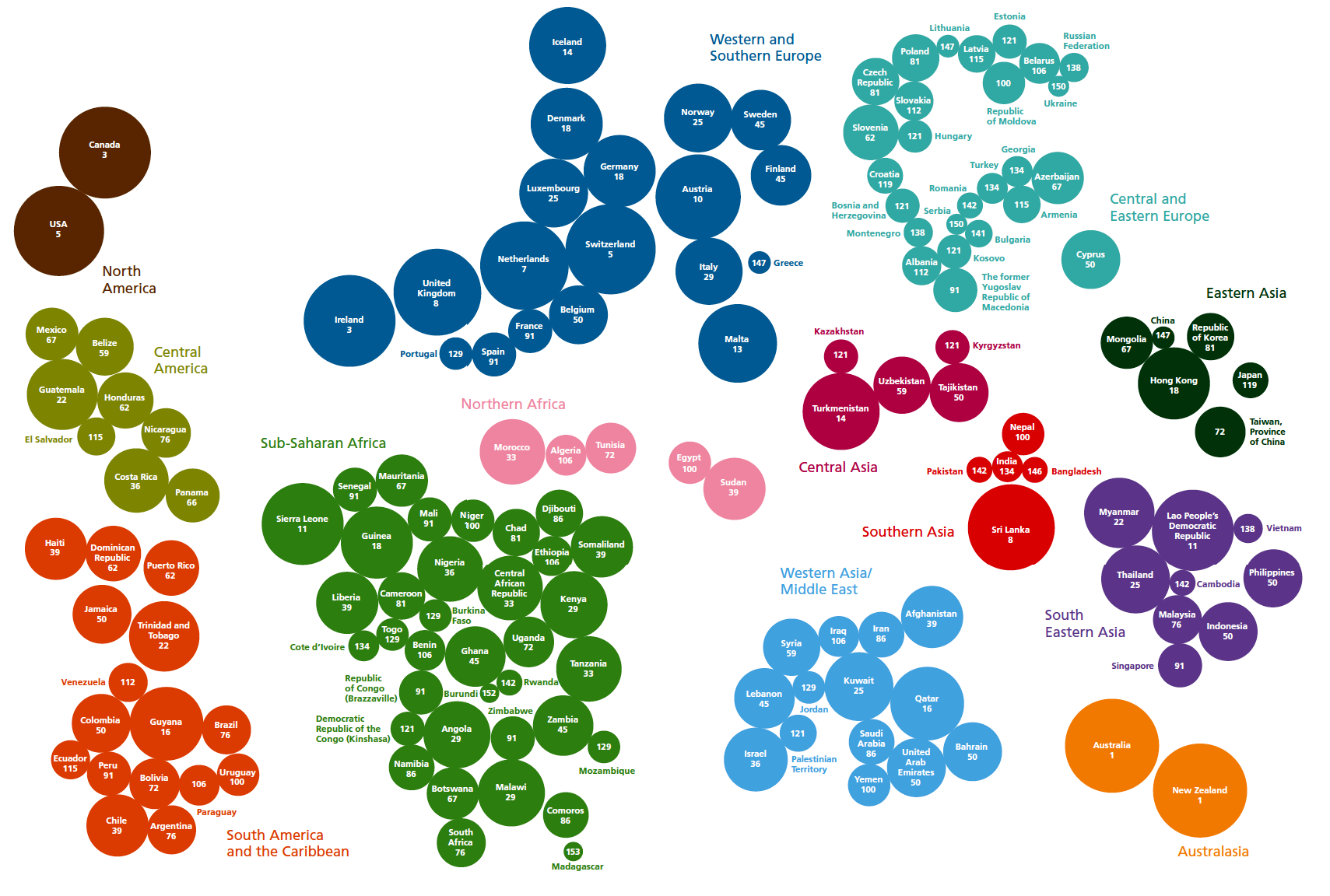
New forms of democratic political participation have evolved from the collective use of Internet technologies. Visualization are big part of this and have proven to create awareness and persuade the public to contribute to society. What kind of forms of visualization are charities using? Charities use a lot of maps. At the Infographics Conference 2012 Jan Willem van Eck talked about cartography and the uses of maps in visualizations. He divided his presentation in four parts. His first part was about data explosion. This refers to the fact, that an increasing amount of organizations are opening their databases to the general public. Using this data can create unique visualizations. For example he mentioned the Mood map made by the New Scientist. The second part was about getting the right projections. Van Eck showed dozens of map projections that have different properties. If you understand the properties, your visualization will be better. His example of the Mercator projection was enlightening. Greenland is very large on the Mercator projection, however it is the same size as Saudi Arabia. His third part was about the rules in cartography. Every data set is unique and the variables should be connected to the right projection. Sometimes a map isn’t the ideal way to visualize your data. So understanding the rules will protect against miscommunication. Van Eck ended his presentation with examples of visualizations that showed something different that wasn’t available if you had analyzed the data set. An example is Nederland van Boven.
“Messages and images mutate as they migrate through the vast variety of media outlets, until questions of source and original intent cease to matter. Governments and corporations often sponsor disinformation campaigns, using media to start rumors or deflect the publics attention from potential scandals.” (Harold 2004)
Members of society have a denotation when it comes to the work of a charity. Their data is considered to be exaggerated to appeal to our emotional side. The examples that Van Eck mentioned can be applied to almost all sets of data. The most important thing is to mind the rules. With open data sets, information is free to be used. Interacting with these tools creates research possibilities. Using maps to create location awareness is just one of the possibilities.
Media activism and charities will benefit from using data visualization in their work. Using existing open databases will give them more scientific acknowledgment and if you know the design rules you do not have to fabricate the data but just choose the right projection.
Sources
Engelhardt, Yuri. (In print, 2012) Graphics – Neurath, Rosling, and the Universal Principles of Visual Representations. On Information Design.
Harold, Christine. “Pranking Rhetoric: “Culture Jamming” as Media Activism.” Critical Studies in Media Communication 21.3 (2004): 189-211.
Lovink, Geert. Zero Comments: Blogging and Critical Internet Culture. New York: Routledge, 2008.
McPhillips, Fiona. “Internet Activism: Towards a Framework for Emergent Democracy.” Critical Studies in Media Communication 25.2 (2006): 117-127.
Mute Books Orders
For Mute Books distribution contact Anagram Books
contact@anagrambooks.com
For online purchases visit anagrambooks.com

